

Task
PaySpot MK is a licensed electronic money institution and payment service provider focused on making everyday financial services simpler, faster, and more accessible.
As the company developed its digital presence and expanded its communication touchpoints, PaySpot MK needed a more consistent visual direction that could work across its digital products, corporate communication, and physical promotional materials.
Our task was to refresh the existing visual identity and translate it into a cohesive experience across the brand’s key touchpoints – from the corporate website and mobile app to promotional materials used in physical locations.
Tactics
We started with a visual identity refresh, refining PaySpot MK’s existing logo treatment through an updated color palette and typography system.
The refreshed palette builds around PaySpot MK’s distinctive combination of deep blue, green and lime accents, creating a visual language that feels contemporary, digital and recognizable.
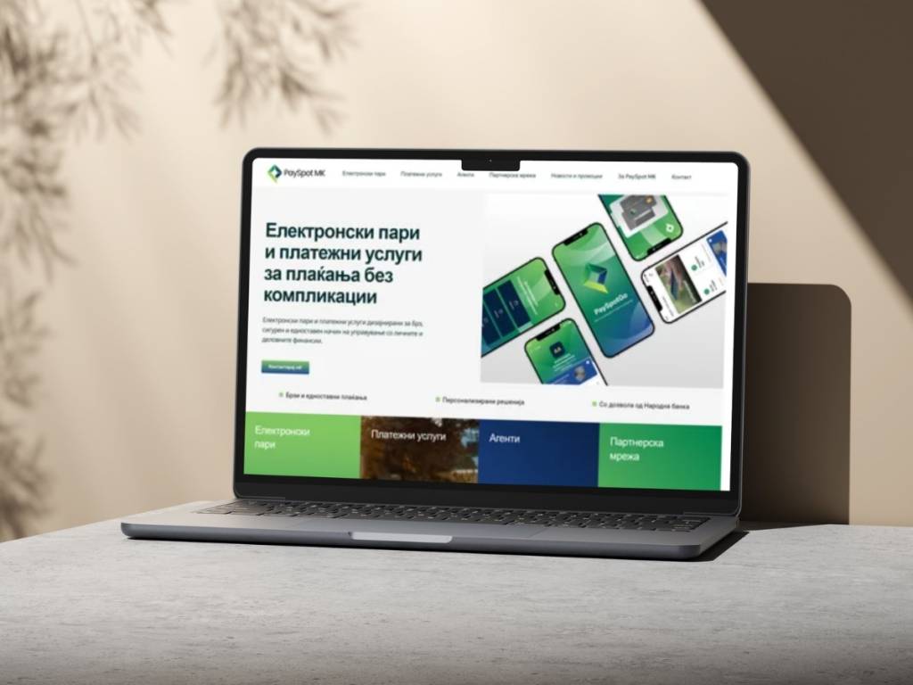
We then carried the refreshed identity into the company’s new corporate website, designing and developing a digital experience that presents PaySpot MK’s electronic money and payment services in a clear and accessible way.
The website brings together information about the company’s services, electronic money, payment solutions and agent network, while giving users a straightforward way to explore the available services and get in touch. The current website also places a strong emphasis on simple, real-time financial management and access to services through digital channels.
Designing the digital product
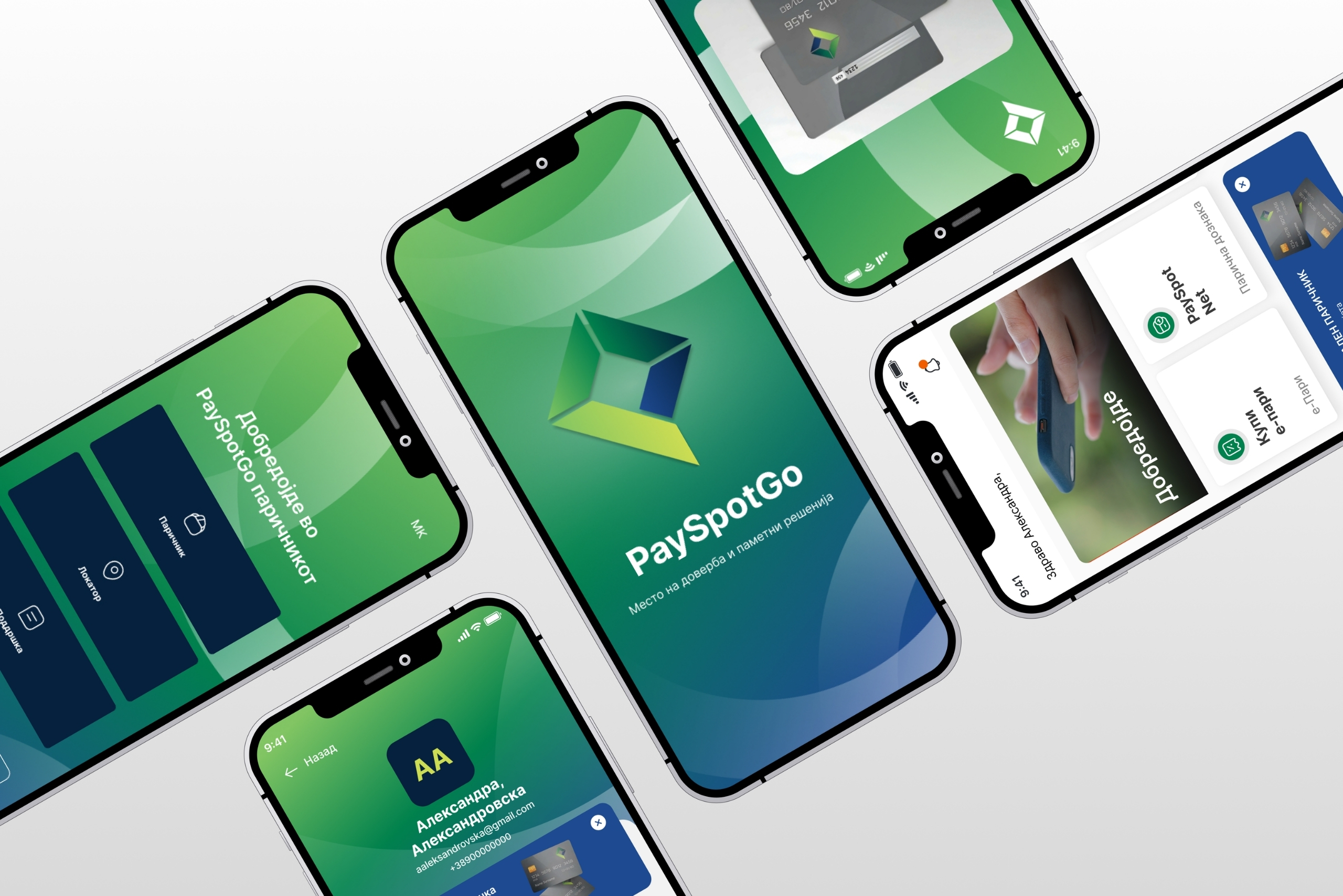
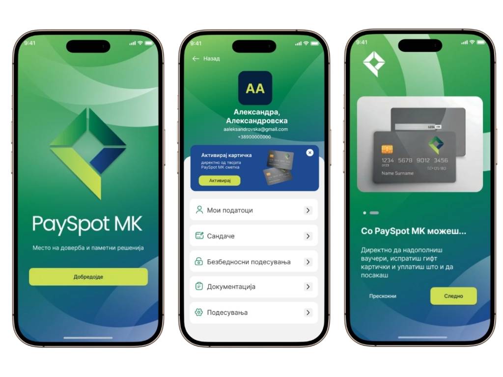
Alongside the corporate website, we designed the screens for the PaySpot MK mobile application, extending the refreshed visual language into product experience.
The app design uses the same colors, typography, graphic elements, and iconography as the wider brand, creating a consistent connection between the corporate identity and the customer’s everyday digital interaction with PaySpot MK.
Bringing the identity into the physical world
To make sure the refreshed identity worked beyond digital channels, we also developed a series of promotional and point-of-sale materials.
These included:
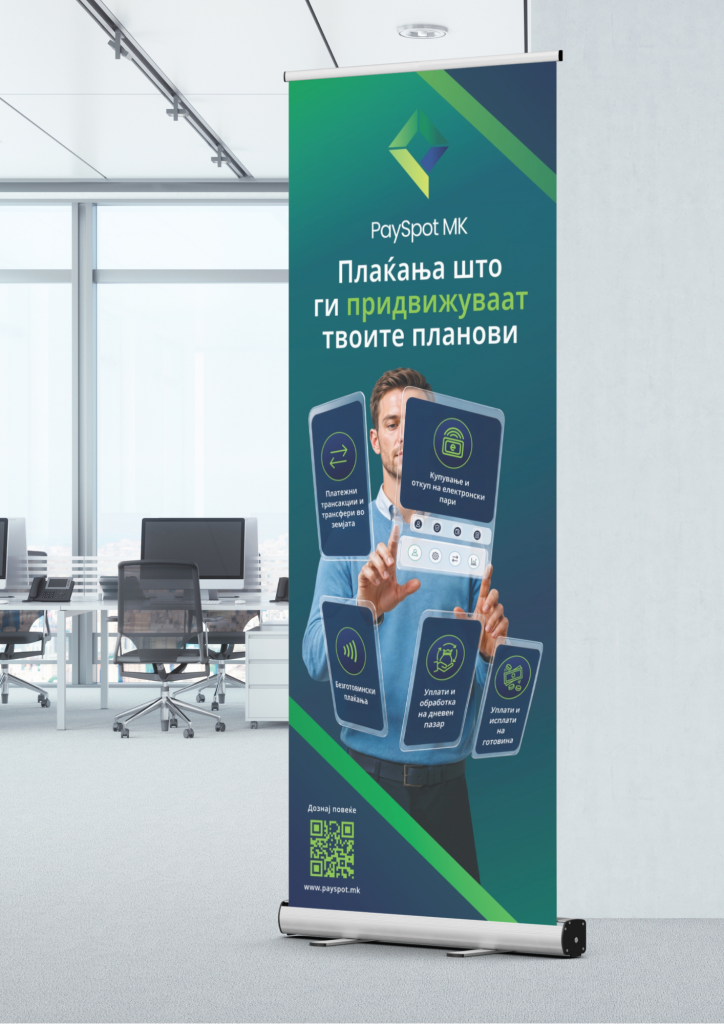
- Roll-up banners
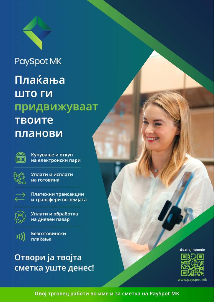
- Posters
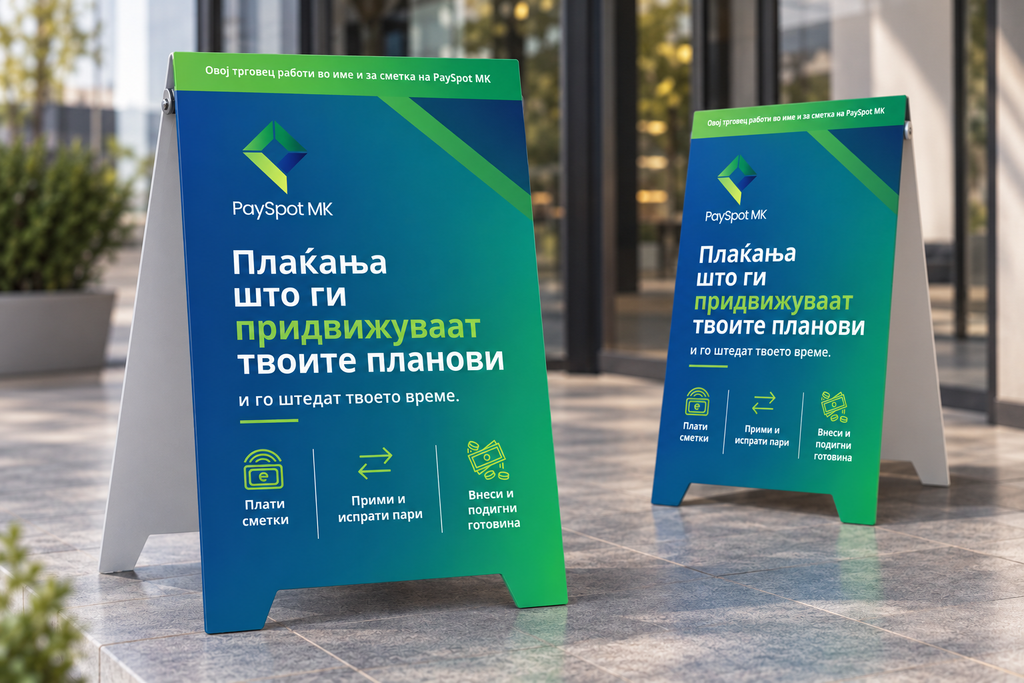
- A-tables
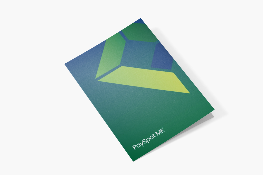
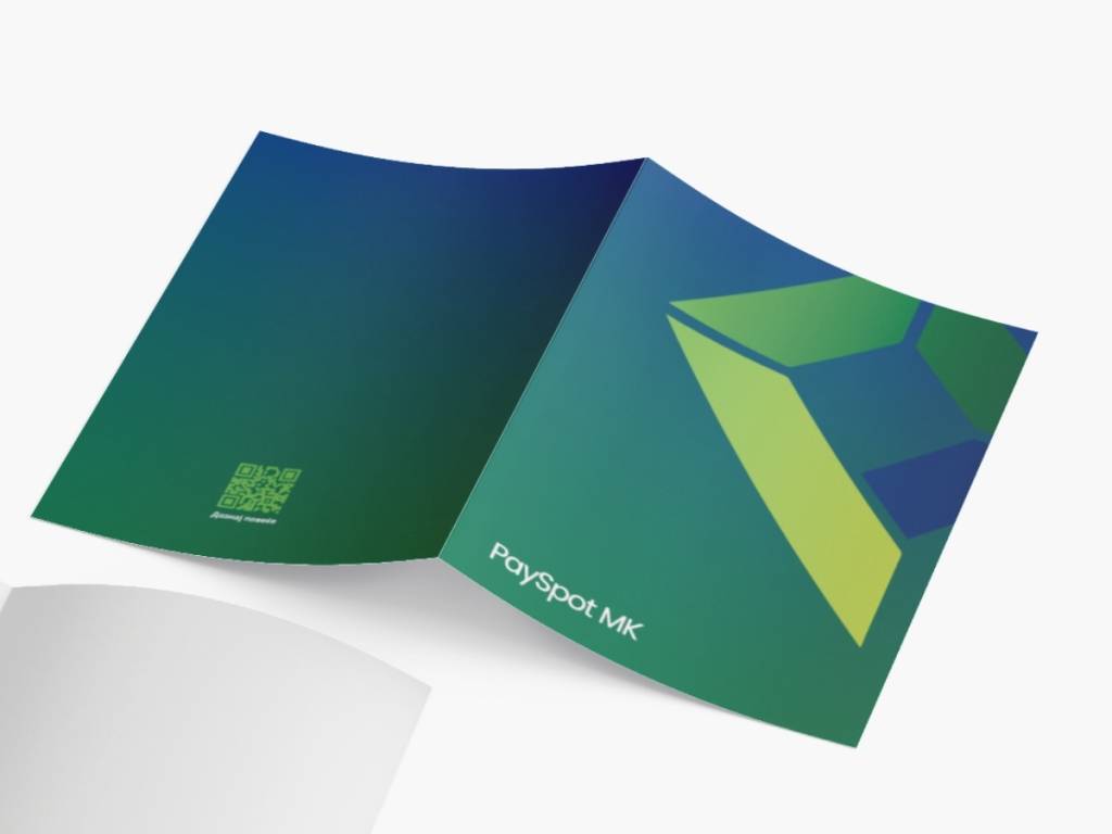
- Corporate folders and printed materials
The promotional designs use PaySpot MK’s refreshed colour system and geometric graphic language to create strong, recognisable brand assets that can work in physical locations and customer-facing environments.
Results
The project created a unified visual ecosystem for PaySpot MK, connecting the brand’s identity with the digital experiences and physical materials through a consistent visual language.
The refreshed identity now works across multiple customer touchpoints – from the corporate website and mobile application to promotional materials in physical locations – giving PaySpot MK a more cohesive and contemporary presence as it builds its position in the digital payments and electronic money space.
See more of our projects here